Hey there, fellow investors and traders! Are you looking to improve your trading skills and make more informed investment decisions in the Indian stock market? If so, you’re in the right place! In this post, we’ll be exploring the world of technical analysis, a powerful tool that can help you navigate the markets with confidence.
But first, let’s start with the basics. What is technical analysis, you ask? Simply put, it’s a method of evaluating securities by analyzing statistical patterns and trends in their price movements and other market-related data. By using charts and other visual tools, technical analysts aim to identify potential trading opportunities and predict future price movements.
Now, we know what you’re thinking. “Isn’t technical analysis just a bunch of hocus pocus?” Well, we’re here to tell you that it’s not! While there are certainly some critics of technical analysis, it’s a widely used and respected tool in the financial industry.
In fact, many professional traders and investors use technical analysis in conjunction with fundamental analysis to make more informed investment decisions.
So, let’s dive in and explore the world of technical analysis in the Indian stock market!
When it comes to technical analysis, chart patterns are a great place to start. These patterns are like roadmaps that help us identify potential trading opportunities and predict future price movements.
Let’s take a look at some of the most common chart patterns:
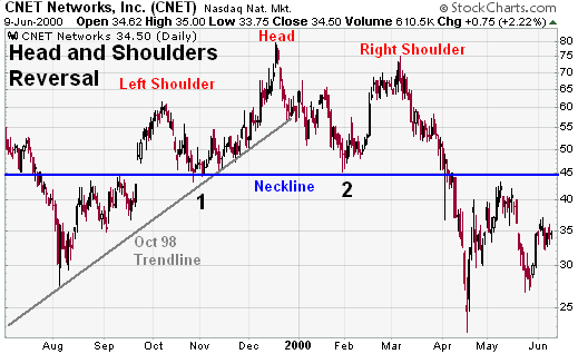
1. Head and Shoulders
The head and shoulders is a popular chart pattern used in technical analysis to identify potential trend reversals. It’s one of the most recognized formations traders look for.
Here’s a breakdown of the head and shoulders pattern:
Shape: It resembles a three-peaked mountain range, with the middle peak (head) being the highest and the two outside peaks (shoulders) being roughly equal in height.
Trend: It typically appears at the end of an uptrend and signals a potential reversal to a downtrend.
Key components of the pattern:
Left shoulder: The first peak on the left side of the pattern.
Head: The middle peak, usually the highest point in the pattern.
Right shoulder: The second peak on the right side, lower than the head.
Neckline: A horizontal line drawn connecting the swing lows (valleys) before and after the head. This line represents support in an uptrend.
Confirmation and additional points:
Neckline break: A confirmed head and shoulders pattern requires the price to break below the neckline, indicating a shift in momentum from buyers to sellers.
Volume: Ideally, there should be higher trading volume on the break below the neckline compared to the volume during the formation of the head and shoulders, suggesting stronger conviction from sellers.
Inverse head and shoulders: This pattern is a mirror image of the traditional head and shoulders, appearing during downtrends and signaling a potential reversal to an uptrend.
Here are some resources to learn more about head and shoulders chart patterns:
Triangle patterns are a common tool used in technical analysis to identify potential price movements in the stock market and other financial markets. They are formed by converging trendlines drawn on a price chart, typically indicating a period of consolidation before a potential breakout.
Here’s a breakdown of triangle chart patterns:
Types of Triangle Patterns:
There are three main types of triangle patterns:
Ascending Triangle: This pattern is formed by price action creating higher lows while maintaining a horizontal resistance line above. It often signals a continuation of an uptrend after a period of consolidation.
Descending Triangle: This pattern is formed by price action creating lower highs while maintaining a horizontal support line below. It can signal a continuation of a downtrend or a potential reversal.
Symmetrical Triangle: This pattern is formed by price action creating both lower highs and higher lows, converging towards a point with no clear upward or downward slope. It can indicate either a continuation or reversal of the prevailing trend.
Interpreting Triangle Patterns:
While triangles can suggest a continuation of the prior trend, they don’t guarantee it. The key signal for traders is a breakout from the triangle pattern.
Breakout: A breakout occurs when the price decisively moves above the resistance line in an ascending triangle or below the support line in a descending triangle. This breakout suggests a continuation of the prior trend.
Breakdown: If the price breaks below the support line in an ascending triangle or above the resistance line in a descending triangle, it can signal a reversal of the prior trend.
Limitations of Triangle Patterns:
False Breakouts: Breakouts can be false signals, and the price may return within the triangle pattern.
Volume Confirmation: Triangle patterns are considered more reliable when accompanied by increasing trading volume on the breakout.
Overall, triangle chart patterns are a valuable tool for technical analysis, but they should be used in conjunction with other indicators for a more comprehensive trading strategy.
3. Wedges
Wedge patterns are technical indicators used in financial analysis, specifically in forex and stock trading, to identify potential future price movements. They are characterized by converging trend lines drawn on a price chart, which can signal a continuation of the current trend or a reversal.
Here’s a breakdown of wedges:
Types of Wedge Patterns:
Rising Wedge: This pattern occurs during an uptrend. The price action forms a wedge shape with two upward sloping trend lines that converge as the price makes higher highs and higher lows at a decreasing rate. It can be a sign of bullish exhaustion and a potential trend reversal to the downside.
Falling Wedge: This pattern occurs during a downtrend. The price action forms a wedge shape with two downward sloping trend lines that converge as the price makes lower lows and lower highs at a decreasing rate. It can be a sign of bearish exhaustion and a potential trend reversal to the upside.
Key Characteristics of Wedges:
Converging Trend Lines: The two main features of a wedge are the trend lines that make up the wedge shape. These trend lines are drawn by connecting the highs and lows of the price action, and they should converge as the pattern progresses.
Decreasing Price Volatility: As the wedge progresses, the price fluctuations tend to become smaller, indicating a period of consolidation. This is reflected by the converging trend lines.
Volume Confirmation: While wedges themselves can be informative, their validity is often strengthened by volume confirmation. Ideally, you’d see trading volume decrease as the wedge tightens, and then increase on the breakout.
Interpreting Wedge Patterns:
A breakout from the wedge pattern signifies a potential trend change.
Breakout Above Resistance: A breakout above the resistance line in a rising wedge suggests a potential upside breakout and continuation of the uptrend.
Breakout Below Support: A breakout below the support line in a falling wedge suggests a potential downside breakout and continuation of the downtrend.
Limitations of Wedge Patterns:
False Signals: Wedge patterns are not foolproof indicators, and breakouts can sometimes lead to false signals.
Subjectivity: Drawing the trend lines can be subjective, and the interpretation of the pattern can vary depending on the analyst.
Overall, wedge patterns can be valuable tools for technical analysts to identify potential price movements. However, it’s crucial to use them in conjunction with other technical indicators and consider factors like overall market sentiment for a more comprehensive analysis.
Trend Analysis
Trend analysis is another important aspect of technical analysis. By identifying the trend, we can make more informed investment decisions and avoid costly mistakes.
So, how do we identify the trend? Here are a few tips:
1. Look for higher highs and higher lows
Absolutely, looking for higher highs and lower lows is a great way to identify trends! This pattern is specifically associated with uptrends.
Here’s how it works:
Higher Highs: A higher high occurs when a price peak is greater than the previous high. This signifies that buyers are in control and pushing the price up.
Higher Lows: A higher low happens when a price trough (bottom) is higher than the preceding low. This indicates that even during dips, the price floor is rising, again suggesting buyer dominance.
When you see a sequence of higher highs and higher lows on a chart, it suggests an upward trend. This is because buyers are continuously willing to pay more for the asset, driving the price up.
Here are some additional points to consider:
Number of highs and lows: While there’s no magic number, a consistent sequence of higher highs and higher lows strengthens the uptrend confirmation.
Timeframe: The timeframe you’re analyzing the chart on can impact the trend identification. Trends tend to be more evident on longer timeframes.
Confirmation: While higher highs and higher lows are a strong indicator, it’s wise to consider other technical analysis tools for confirmation before making any trading decisions.
2. Look for lower highs and lower lows
Lower highs and lower lows are a telltale sign of a downtrend. This pattern indicates that sellers are in control of the market and driving prices down.
Here’s how to identify lower highs and lower lows:
Lower Highs: Each subsequent price peak (high) is lower than the one before it.
Lower Lows: Each subsequent price trough (low) is lower than the one before it.
Imagine a chart with price movements over time. In a downtrend with lower highs and lower lows, the peaks and valleys keep getting progressively lower. This suggests a weakening buying force and a strengthening selling force.
Here are some additional points to consider:
Strength of the Trend: The more frequent and steeper the lower highs and lower lows, the stronger the downtrend.
Confirmation: A downtrend is often confirmed by an increase in trading volume on down days, signifying more sellers are participating in the price decline.
Potential Reversal: A break above the previous lower high can be a sign of a potential trend reversal, indicating that buyers might be regaining control.
Overall, lower highs and lower lows are a valuable tool for trend analysis, especially in technical analysis used in finance. By recognizing this pattern, you can make informed decisions about buying or selling assets based on the perceived trend.
Do you have a specific chart or market you’d like to analyze for lower highs and lower lows?
3. Use trend lines
Trend lines are a graphical tool used in trend analysis to depict the underlying direction of data points over time. They are essentially straight lines drawn on a chart to connect several data points, highlighting a trend of increase, decrease, or stagnation.
Here’s how you can use trend lines for trend analysis:
Identify the Trend: Look at your data and try to visually identify a general direction. Is it consistently increasing, decreasing, or flat?
Draw the Line: Place the trend line along the data points. There are two main types of trend lines:
Upward Trend Line: Connects a series of low points and slants upwards, indicating a general increase over time.
Downward Trend Line: Connects a series of high points and slants downwards, indicating a general decrease over time.
Interpret the Slope: The slope of the trend line indicates the strength and direction of the trend. A steeper slope suggests a more rapid change, while a shallower slope suggests a gradual change.
Data Exceptions: Not all data points will perfectly align with the trend line. There will be outliers that fall above or below the line. These outliers can be caused by random fluctuations or specific events.
Limitations: Trend lines are a simplification tool and shouldn’t be solely relied upon for prediction. External factors can cause trends to shift or reverse.
Here are some additional points to consider:
Drawing the Line: There’s no single “correct” way to draw a trend line. You can use your judgment to position it in a way that best captures the overall direction of the data.
Multiple Trend Lines: In some cases, you might identify multiple trends within your data, requiring multiple trend lines on the chart.
Software Tools: Many data analysis software programs and charting tools offer trend line functionality. These tools can help you visualize trends and sometimes even suggest potential trend lines based on statistical analysis.
By using trend lines effectively, you can gain valuable insights from your data and make better-informed decisions in various fields, be it finance, business, science, or any other area that involves analyzing data over time.
Support and Resistance
Support and resistance are fundamental concepts in technical analysis, which is a way of studying the financial markets by looking at historical price charts and patterns. Here’s a breakdown to expand on your explanation:
Support:
Think of it as a buying zone. The price has a tendency to stop falling and bounce back up when it reaches this level. This happens because there’s an influx of buyers who see the price as a good value and step in, pushing the price back up.
Resistance:
Imagine it as a selling zone. The price has a history of stopping its rise and dipping back down when it reaches this level. This is because sellers see it as an opportune moment to cash in on their profits, causing the price to retreat.
Why are they important?
By recognizing these levels, you can anticipate potential turning points in the price movement. This helps you decide:
Entry points: You might consider buying near support levels where the price is likely to bounce back up.
Exit points: You might consider selling near resistance levels to lock in profits before the price goes down.
Remember:
Support and resistance aren’t exact lines, but rather zones or areas on the chart. The more times the price tests a level and bounces, the stronger the support/resistance becomes.
Market conditions can change, and these levels can break. So, it’s crucial to use support and resistance in conjunction with other technical indicators for a more comprehensive analysis.
By understanding support and resistance, you gain valuable insights into potential price movements, allowing you to make more strategic investment decisions.
Indicators
Indicators are like the secret sauce of technical analysis. They’re the tools that help us identify potential trading opportunities and predict future price movements.
Here are a few of the most popular indicators:
Moving Averages: These are a great way to smooth out the price action and identify the trend.
RSI (Relative Strength Index): This indicator measures the strength of the trend and can help us identify overbought and oversold conditions.
MACD (Moving Average Convergence Divergence): This indicator measures the difference between two moving averages and can help us identify potential trading opportunities.
Candlestick Patterns
Candlestick patterns are a valuable tool for understanding price movements in the stock market. They offer visual cues based on the open, high, low, and close (OHLC) prices for a specific timeframe. By recognizing these patterns, traders can potentially:
Identify potential trading opportunities: Candlestick patterns can signal potential reversals in trends, continuation of trends, or areas of indecision. This information can be used to decide whether to buy, sell, or hold a stock.
Gauge market sentiment: The formation of certain candlestick patterns can reflect the overall sentiment in the market, whether bullish (optimistic) or bearish (pessimistic).
Confirm other technical indicators: Candlestick patterns can be used alongside other technical analysis tools like moving averages or oscillators to strengthen trading signals.
Here’s a breakdown of the examples you provided:
Hammer: This pattern resembles a hammer, with a long wick extending down and a short body. It suggests a price drop followed by a strong recovery, potentially indicating buying pressure and a possible trend reversal upwards.
Shooting Star: Opposite of the hammer, this pattern looks like a star shooting up with a long upper wick and a small body. It signifies a price rise followed by a decline, possibly indicating selling pressure and a potential trend reversal downwards.
Bullish Engulfing Pattern: This two-candle pattern is bullish. The first candle is bearish with a red body. The second candle, completely engulfs the first candle’s body, opening lower but closing significantly higher, ideally above the previous day’s high. This suggests strong buying pressure and a potential trend reversal upwards.
It’s important to remember that candlestick patterns are not foolproof indicators and should be used in conjunction with other forms of analysis to make informed trading decisions. There are many other candlestick patterns to explore, and some resources offer in-depth explanations with illustrations and trading strategies.
Conclusion:
And there you have it, folks! Technical analysis is a powerful tool that can help you navigate the Indian stock market with confidence. By using charts, trend analysis, support and resistance levels, indicators, and candlestick patterns, you can make more informed investment decisions and avoid costly mistakes.
Of course, technical analysis is just one tool in your toolbox. It’s important to combine it with fundamental analysis and other forms
👉 Learn Stock Market || Stocks Analysis
|| Learn Trading || IPO Updates
|| Join Whatsapp Channel
and read Stock Market related Blogs on Stockesta.com. Disclaimer: The information provided on this website is for informational purposes only and should not be construed as financial or investment advice. Users are advised to do their own research and consult a qualified financial advisor before making any investment decisions.